

Brand
Guidelines

logo

Usage Guidelines

01
Logo Usage
Generally, the “logo colors” act as pop colors in illustrations or icons but should not be used in design elements.
02
Brand Assets
Please do not use, display, mirror or frame (including in metatags or hidden text) our company assets.
03
Color Palette
Avoid deviating from the core set of colors or creating tints of these values.

Logo

Our logo is our most valuable asset. It's not a shape-shifter, and doesn't have plans to become one anytime soon. So, please do not edit, change, or distort it in any way.

  • Full-color logo with icon and logotype
  • Minimum clear space: Maintain clear space equal to the height of the "N" in Newtum around all sides.
  • Minimum size in Menu: 200px width * 45 height for digital, 1.5 inches for print
Download Logo

Logo Variations

  • Full-color (for light backgrounds)
  • White (for dark backgrounds)
  • Monochrome (single-color for one-color applications)

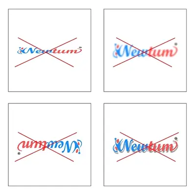
Logo: Incorrect Usage

Our logo is our most valuable asset. It's not a shape-shifter, and doesn't have plans to become one anytime soon. So, please do not edit, change, or distort it in any way.
Aa Bb

Typography

The Jost, sans-serif is our company font. We always use it. When you’re writing, use it. When you're making a presentation, use it. When in doubt, use Jost, sans-serif.

Jost, sans-serif also comes in bold. It’s called Jost, sans-serif Bold.

Font Family:
  • Primary: font-family: Jost, sans-serif;
  • Secondary: Roboto for technical content

Typography

Use Case Font Size
Headline (H1) 36px
Sub-headline (H2) 28px
Section Titles (H3) 22px
Body Text 16px
Caption/Labels 12px
Headline 600–700
Body 400
Captions 300–400
Font Weights Size
Headline 600–700
Body 400
Captions 300–400

Colors:

  • Text: black
  • Optional: Slate Gray: #77838f
  • Headings: #2f2d51
Letter Spacing: Normal

About
Jost, sans-serif

A little bit of history about this amazing font. According to the Google font website, it was designed to illustrate the unique relationship between mankind and machine. Are you feeling that when you look at this font? Because we are.

Primary: Dodger Blue or Bright Azure
#1c8fff
80% #1C8FFFCC
60% #FF553099
40% #1C8FFF66
20% #1C8FFF33

Color Palette

Our primary color is Radical Red or Coral Red. We use variances ranging from apricot to nectarine, depending on how tangy we feel.

Color Palette

Our primary color is Radical Red or Coral Red. We use variances ranging from apricot to nectarine, depending on how tangy we feel.

Primary: Radical Red or Coral Red
#FF5353
80% #FF5530CC
60% #FF553066
40% #FF553066
20% #FF553033

Button & UI Styles

Primary Button

  • Font family: Jost, sans-serif
  • Background: #115CFA
  • Text: #FFFFFF
  • Font Size: 16px
  • Border radius: 6px
  • Padding: 12px 24px (minimum)
  • Font Weight: Medium (500)
  • Letter Spacing: normal

Secondary Button

  • Font family: Jost, sans-serif
  • Background: #FF5353
  • Text: #FFFFFF
  • Font Size: 16px
  • Border radius: 6px
  • Padding: 12px 24px (minimum)
  • Font Weight: Medium (500)
  • Letter Spacing: normal
Hover States
  • Slightly darken the background color
  • Apply 5% drop shadow for depth

Iconography

Our iconography is connected to our typography at a fundamental level. It, too, was designed to illustrate the unique relationship between mankind and machine.

Icons and their usage principles enable you to communicate quickly and effectively across all touchpoints.

  • Use flat, line-style icons with 2px stroke
  • Ensure consistent stroke weight and corner radius
  • Stick to brand colors or neutral tones
  • Max content width: 1200px
  • Grid: 12-column responsive grid
  • Navigation font: 16px, Jost, sans-serif Medium
  • Footer:
    • Background: #F7F9FB with white text
    • Text Color: #000000
    • Font Size: 14px
    • Line Height: 22.4px
    • Font Weight: Regular (400)
    • Letter Spacing: normal

Website & App Guidelines

Consistency Across Projects

  • Each project may include its own primary or secondary menu based on functional needs, but the overall look and feel should remain consistent with the main domain (newtum.com).

  • Brand consistency in menus ensures a unified user experience across all subdomains or applications.

  • Clicking on the Newtum logo (whether in the header or footer) from any page or subdomain must redirect users to the main domain: https://newtum.com.

  • Ensure that header and footer branding elements mirror the main site’s layout and styling for visual continuity.